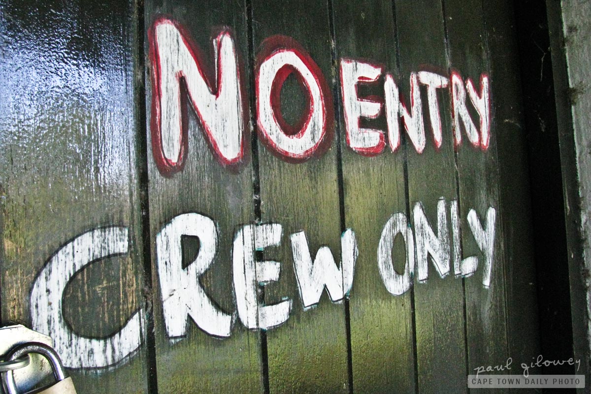
I often wonder to myself why signs like this one (especially in shops and restaurants) seem so aggressive. They have signs to welcome us and make us feel as though we, their clients, are super-important to them. In their marketing messages they even call us "valued clients". However, in their store or restaurant their signs are devised to be aggressive and intolerant. What's with that?
How about "No need to peek, there's nothing but very busy elves behind this door. Ring this buzzer or call 0800 555 1234 if you need a human's help."? Doesn't that sound a little more friendly, and a little more useful?
Val
A thought-provoking post and one with sentiments I thoroughly endorse. Perhaps the growing trend towards glassed-in kitchens open to restaurants is a change from the “keep out” attitude.
Jonathan Carter
Nice photo, we seem to find similar things interesting a lot of the times. I like the use of the red and black outlines on that texture, could look really cool on a pamphlet or cd cover. I think I’ll steal that idea some time :)
Paul
Post authorPerhaps Val, perhaps. I’ve only come across such kitchens in upper-market restaurants though. I’m still afraid to see into the kitchen of more “regular” restaurants. :)
I’m glad that I’m not the only one! And, yes, go ahead – I don’t think anyone will claim copyright to the idea. :) Are you planning on recording an album?
Jonathan Carter
Recording an album? Very, very far from that, but I’m working on lyrics for about 5 songs atm and learning to play guitar, so *maybe* one day :)
Ali
Haha, that’s nice. Now I need a reason to use these words… :D
Paul
Post authorLol, I thought that was pretty funny myself. :D