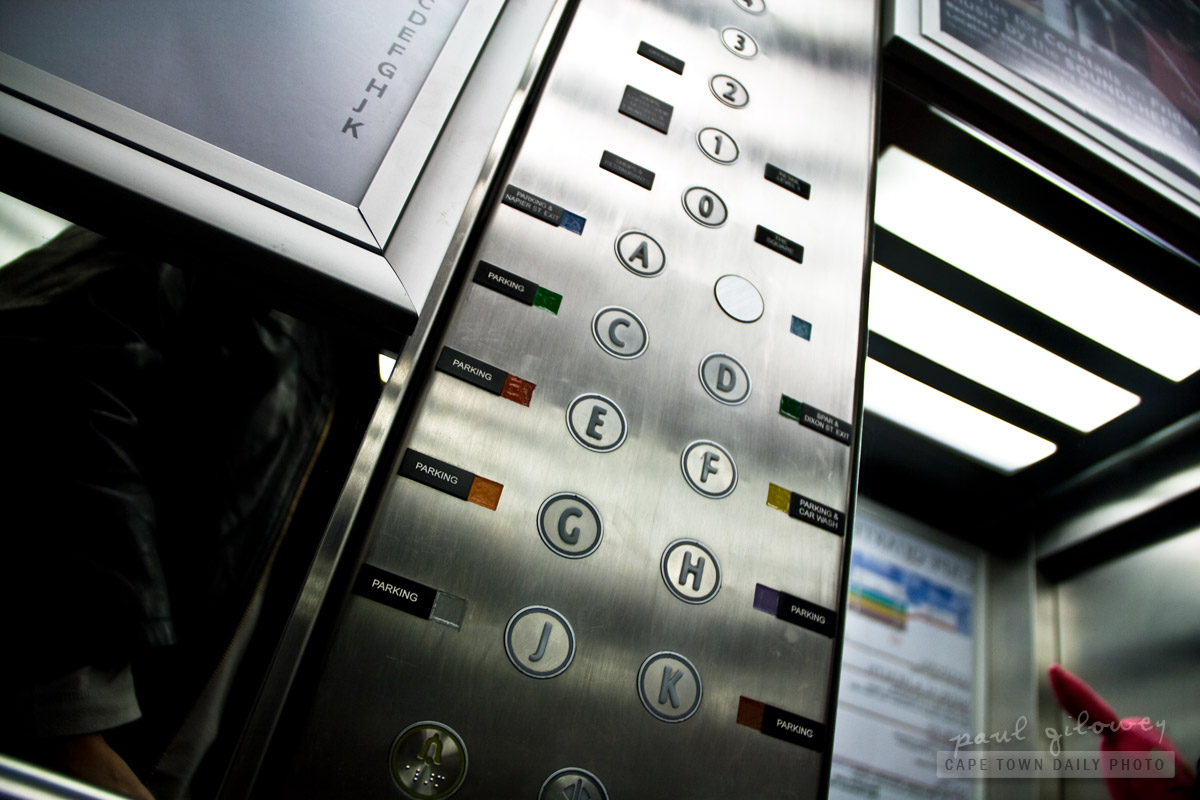
- a combination of numbers and letters are used for floors
- the letter G isn't used for the ground floor
- basement parking levels start at a number greater than 0
- floors are numbered with various colours that seem to mean something important
- floors are labeled with landmarks unknown to me
This is the elevator at the Cape Quarter. Upon entering one is met with a combination of the points I made above. Not only this, but one's also overwhelmed by a large poster, a confusing legend, that attempts to guide visitors to the right button.
All that I wanted was to go to the ground level - but as the doors closed and the elevator departed, overwhelmed, I found myself pondering the merits of taking a trip to destination unknown.
mjw
That’s horrible usability. I can’t believe someone designed that and then someone else actually authorised it to be used.
If your “functional” design needs a legend it’s not intuitive and you have failed as a designer.
Makes me want to go and see the lift now, though. Thanks for that.
Paul
Post authorThanks mjw – glad that you agree! While you’re visiting, perhaps you should indulge in macarons from Daniela’s while you’re there. :)
Chris M
Those are sweet!
Paul
Post authorThe macarons you mean? Of course you do. :)